Frontpage elements
- Written by Super User
- Category:
- Hits: 1213
The frontpage is based on the Custom HTML modules. This page contains a description for the elements not described on the Module Variations page.
Important! The described HTML examples doesn't contain the data-scrollreveal attributes used for the animation effects.
Points list and columns
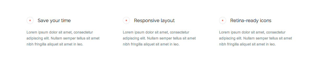
In order to create the list with points, you have to use the following structure:
<div class="gk-point">
<h4>Responsive layout</h4>
<p>Lorem ipsum dolor sit amet, consectetur adipiscing elit. Nullam semper tellus sit amet nibh fringilla aliquet sit amet in leo. </p>
</div>
Columns needs main wrapper with gkCols class and data-cols attribute:
<div class="gkCols" data-cols="2">
<div>
First column content
</div>
<div>
Second column content
</div>
</div>
You can create a layout with 2-5 columns using this structure.
Image on the right side
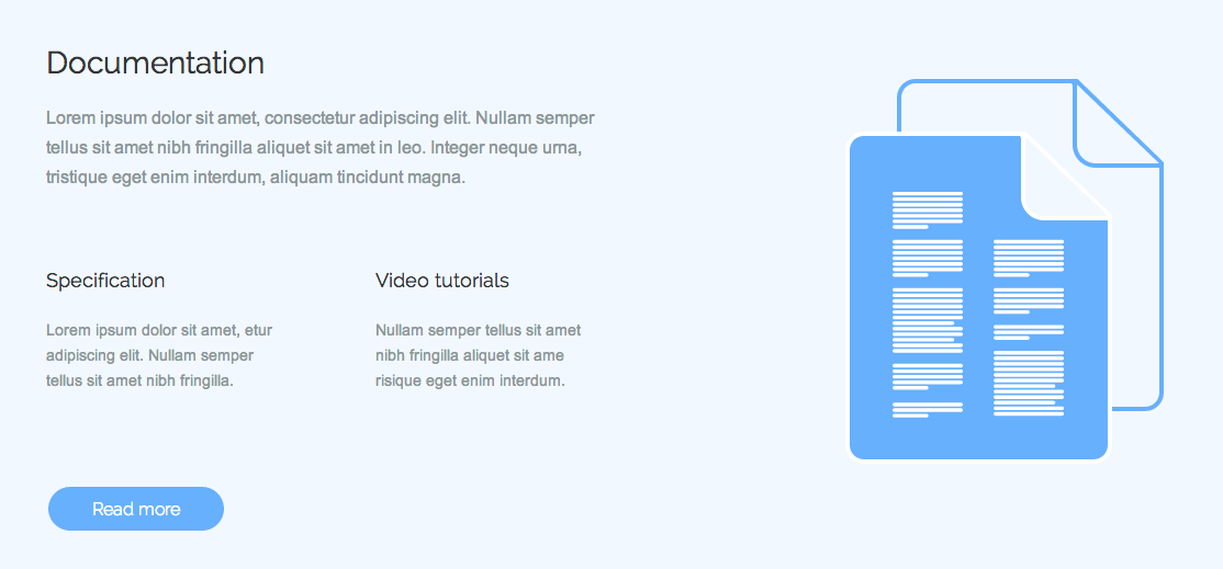
If you want to place image on the right side, you should use image-right module suffix and wrap the whole content excepting the image with the div container.
Big buttons and big icons
In order to create the big buttons or icons you have to add to the link / icon element the following CSS classes: gk-big-btn or gk-big-icon.
Image on the left side
If you want to place image on the left side, you should use image-left module suffix and wrap the whole content excepting the image with the div container.
If you want to put an image on the bottom edge of the container as in the above screenshot, please add to the image the to-bottom CSS class.
List
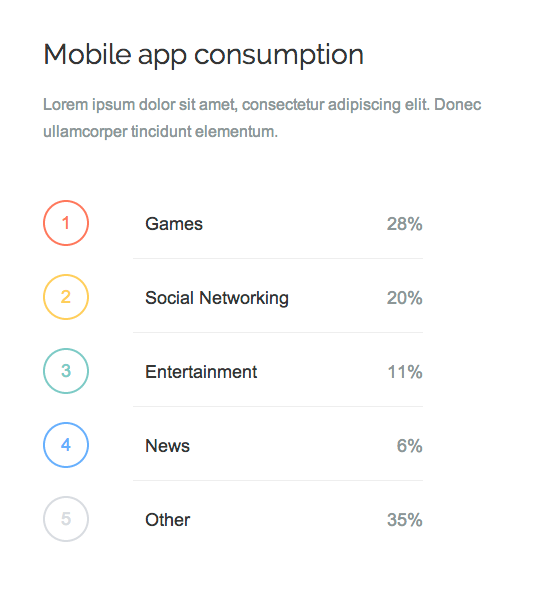
The list with big numbers uses the following syntax:
<ol class="gk-list">
<li class="color-X">Games <strong>28%</strong></li>
...
</ol>
Where CSS class color-X can be one of the following CSS classes: color-blue, color-red, color-green, color-yellow, color-grey.
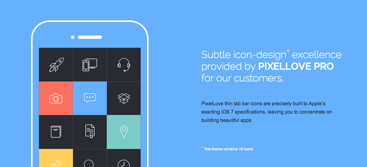
Features list
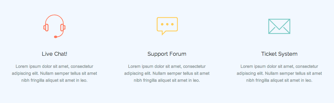
Every feature with icon uses the following syntax:
<div class="gkFeature">
<i class="icon-headset icon-color1"></i>
<h3>Live Chat!</h3>
<p>Lorem ipsum dolor sit amet, consectetur adipiscing elit. Nullam semper tellus sit amet nibh fringilla aliquet sit amet in leo. </p>
</div>
For icons you can use following CSS classes connected with colors: icon-color1, icon-color2, icon-color3
The full list of the icons from the Pixellove iconset:
- icon-rss
- icon-book
- icon-box
- icon-calendar
- icon-camera
- icon-certificate
- icon-chart
- icon-chat
- icon-devices
- icon-email
- icon-folder
- icon-headset
- icon-hits
- icon-loop
- icon-marker
- icon-pin
- icon-rating
- icon-rocket
- icon-tag
- icon-timer
- icon-user
- icon-video
- icon-zoom
Testimonials
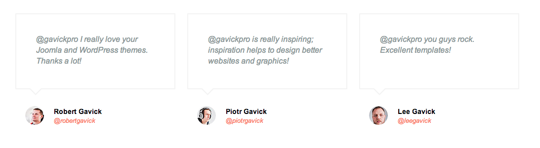
The structure of the single testimonial is following:
<blockquote>
<p>@gavickpro is really inspiring; inspiration helps to design better websites and graphics!</p>
<img src="/images/demo/testimonial_avatar_2.jpg" alt="" /><strong>Piotr Gavick</strong><a href="#">@piotrgavick</a>
</blockquote>
Newsletter
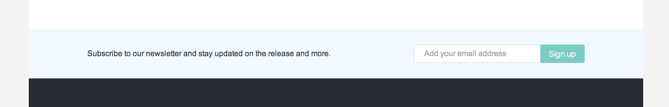
Module with the newsletter form should have the <strong>newsletter</strong> module suffix. The HTML structure used in the module is following:
<p>Subscribe to our newsletter and stay updated on the release and more.</p>

<form action="#">
<input type="email" placeholder="Add your email address" name="email" />
<input type="submit" value="Sign up" />
</form>